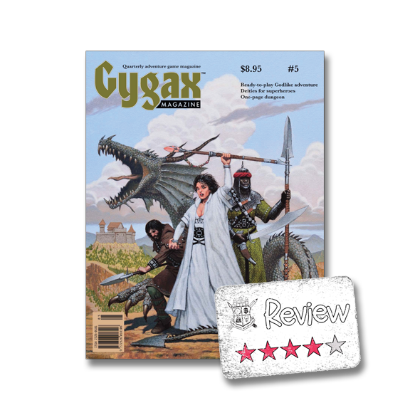
I'm going to go right on ahead and address the "elephant" in the room: Gygax Magazine's release schedule blows chunks, and their problems getting an issue out in time is problematic to the point where I expect it hurts sales and interest. This is issue #5 of what was intended, and by all accounts still pretends to be, a quarterly publication. I picked up #1 two years ago, so this being #5 pretty much makes Gygax Magazine biannual.
Now I'm ok with this. I'd rather have a quality magazine less frequently than one pumped out just because they can. I just wouldn't pick up a subscription based on time. Now I don't know how well they've fared with their subscribers, but I'll give them the benefit of the down that "annual" subscribers got their first four issues for the price of one year's subscription. I'm sure if that isn't the case I'll be hearing about it later.
The first thing I did id go through and look at some of the design/layout/typeface elements that I noticed in the earlier reviews. For the most part it looked like the magazine is improving, but there were still a couple items that seemed "off", especially for a professional magazine. There were only two pages where the font was off and I'm still uncertain if it was a PDF rendering issue or not. That really isn't that big of a deal, but I think I would have noticed it if I wasn't looking for it. I also noticed that a couple of articles jumped from the standard two-column layout to a three-column layout, which just seemed "off".
One thing that really isn't forgivable is the way that some of the graphics were handled. Now I get it if a company gives you some bad graphics for their ads, so things like the ugliest ad ever on page 25 (27 of the PDF) is something you just have to suck up. I know I complained about the one ad in #4, but the white border should have been tweaked. Some other items that should have been tweaked can be found on pages 64 (78 of the PDF) and 41 (43 of the PDF).
Look at this example on the right. Maybe this is just me, but I'm not a fan of the bog box of white surrounding the art. They do this again on the next page. The art here doesn't seem to belong to the article, visually speaking. If they had removed the white background I think it would've "popped" in a good way.
Now I am cognizant that this is an opinion only and since I'm not exactly trained as an artist....actually I don't think I've ever taken an actual art class that involved artistic creation (sorry, but ART 100 didn't count).....I can't speak from authority here. Those with training and talent in this sphere can correct me and I'll let it drop.
I do not think you need any talent or training to see that Gygax Magazine really dropped the ball on this art piece. I'm terrible at remembering names, but I recognize this artist and I've always liked his/her work. Here is the piece in question:
Not only wasn't this picture cleaned up for publication, but it was hacked on a bit. You can see some dirt/smudges/artifacts around the edges (spot #1 is one example) and there is the slight blending where the artist probably did some erasing to get the mouth right (spot #2). I really don't know why you'd run this piece as-is, but if that was your plan, then run the piece as-is! You can see that they ended up cutting off the far right edge of the work in spot #3. This is just inexcusable! You know that the subjects left hand had to be breaking the border like the right hand did.
R. Scott Taylor (Art Director) or some editor really screwed this up, which is not what you want to see from a "professional" publication that had 6 months to get this right.
Wow, I'm almost exhausted getting this far on a few items of a review. It is just frustrating when these same general types of issues keep cropping up. I probably wouldn't bat an eye if this was & Magazine, but frankly I didn't pay $5 for their magazine and they don't have these issues anyway.
I know the core of the magazine is the articles, well maybe the articles and the advertising, but I'll focus on the former. All this "dressing" is far less important than the actual articles and I have to admit that I like reading the articles still. I'd say I enjoyed about 70% of the articles, which I didn't think I would by looking at the table of contents. The articles are quite varied and I'm surprised at how much I liked the article about variant rules/tactic for playing Munchkin. Munchkin is one of those games I have way too much of and pretty much never play, so me finding that article interesting & useful kind of hit me sideways. The "critical hit" article required more than one read to get my head wrapped around it and I'll probably never use the information given, but I could see it being useful to others.
Some may like the GODLIKE adventure that was a special insert, but I barely glanced at it. If someone else needed a warm body to round out their table I'd re-visit it, but otherwise it was just filler for me. Since most of this was "extra" content, I didn't factor that into my 70%.
TL;DR: A bit slow in coming out and still has some layout issues, but worthwhile as a $5 PDF. I don't think I'd buy a print version though.


0 comments :
Post a Comment