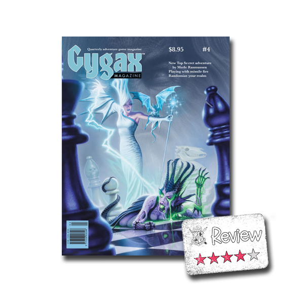
A quick trip to DriveThruRPG solved that issue and now I can review this latest issue.
Overall I liked the issue. Since this is a professionally-produced & printed magazine I first went through the PDF version just as a quick flip-through to see what jumped out at me. I was a little disappointed that there were lots (quite a few anyway) of little layout or graphic bits that were just off. Some of the typeface seemed either fuzzier or heavier on certain pages than others, which may very well be just a PDF rendering issue, or maybe even something added when watermarked.
This is an example taken from pages 6 and 7 of the issue. Both paragraphs should be formatted, and therefore look, the same. This wasn't too common, but I noticed several pages that had the effect shown on the right.
Now even if I chalk the text issue to PDF rendering issues, I was surprised by some odd art layout and what appeared to be visual placeholders sticking out from behind other graphics. The Table of Contents on
page 4 has a cool envelope someone sent in, but is rather jarring & not explained. If you flip the page to the Editor's comments you see a perfect example of what I'm talking about. There is an add for Gamer Seeking Gamer that looks like it was opened in a graphics editor and instead of being cropped to fit was instead flattened and inserted, but not quite in place over the black placeholder that was already on the page.
Now I'm no layout expert, nor am I a graphics designer by training....at best I dabble with Photoshop, but if I notice these things I would expect a team of folks getting paid to do this, presumably with said training, should have picked up on it.
I'm not trying to be dickish or mean, just $9 for a cover price ($5 PDF) I would expect a bit more. Fortunately I picked this up for the content and I wasn't disappointed.
There is a lot of this issue I really won't ever use and I was perfectly OK with that. I don't play Top Secret so a 22 page adventure is largely wasted on me. I only scanned those two articles, but it did pique my interest enough I might try a game at a con if the opportunity arises. If that happens I may be glad I didn't read the adventure straight through.
There were three main articles I really liked. Michael Varhola's "Men and Monsters of Polynesia" was a great primer on running a game in Polynesia. I was immediately reminded of an associate's small island campaign and thought this would have worked in well. Dave Olsen's "The Necromancer's Cookbook" will undoubtedly see some action at my table in the future. I also really enjoyed Ed Greenwood's "Ed's Effulgent Euphemism". It was written for the 13th Age RPG, which I don't play, but the overall concept was good enough for me to want to "liberate" it for my home game. There were other good articles in the issue, just that these three were my favorites.
This last article though, Ed's Effulgent Euphemism, did bring up one final (minor?) gripe for me though, and that is proper capitalization. As I read the article there were proper nouns that were not capitalized, which actually made the article more difficult to read for me. The gist of the article is renaming spells and giving them slightly different effects and the named spells are rather wordy and needed capitalization. Now I don't know if this is Ed's doing, or an Editor's because this issue extended to article titles throughout this magazine issue. Ed's article is appropriately capitalized, but pretty much none of the other articles are. Maybe this is some design choice, but if it was it should be uniformly applied.

I realize that this may seem like either a bad review or just a nit-picky one, but overall I did like this issue. It holds some utility for me as a GM and I don't expect to get too much use out of a magazine that covers such a broad range of games. With just a bit more attention to detail I think Gygaz Magazine could be even better.


0 comments :
Post a Comment